
Strategic Property Group
Case Study
Creating a new brand identity, website and communication plan for one of Perth’s leading development project sales & marketing companies.
Brand & Logo Design
Designed a new logo and brand style guide to reflect the new direction.
Website Design
Swiftly designed and launched a new branded website.
Change Communications
Managed the brand transition through effective change communications.
As 50% owners and key sales consultants at one of the state’s leading property agencies to market and sell development projects, Steve and Nicole Jones’ bought out the established WA brand.
As the company carried the name of the previous owner, Steve and Nicole and embarked on a project to rebrand as Jones Realty & Projects.
Our challenge was to rebrand without disengaging the established recognition of both customer and developer, and to have the new branding ready to launch within 60 days, when the agreed handover period was to end.
The project included scope for a new logo, brand style and a new website which showcased the companies core services, including the new offering of residential listings for sale.
Competition within the industry is significant. Epitomising accessibility and top-of-market professionalism in the branding was key.
Following a kick off meeting, we began working on logo and brand designs that aligned with the client brief.
Due to the fast turn around required, we also developed the wireframes for the website design at the same time, considering optimum user experience and audience prioritisation.
Jones Realty & Projects had existing clientele, both property development clients (with or without current projects), and past customers who may refer. We needed to consider planning the roll-out and communication with the existing customer base.
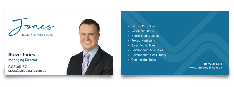
The brief for the brand was simple. The Jones Realty & Projects brand needed to reflect the company – a sophisticated, professional, and efficient leader in the sale of premium Perth development property.
We chose a modified, legible handwritten cursive as the base logo. It emphasises the personal approach of the company’s vision to help people and become their property partner for life. The subtext “Realty & Projects”, written in a sharp, geometric sans-serif typeface, gives the logo context. People who are not familiar with the brand will understand that “Jones” is operating in the real estate industry. The relative sizing and spacing then allowed the portrayal of a stylish, simplistic, and clean-cut logo.
The primary colour of the logo is a medium-dark blue that leads to contrast on a white or light background. The classic corporate blue helps to position Jones as a trustworthy brand in the market, while creating a clear differentiation from the previous branding, which had a leading red element.
We also considered tone of voice and messaging to help portray a personal approach, alongside having Steve and Nicole front and centre.
We designed the main home page of the new website to feature and address the changing of the guard. This informed the existing and new clientele who Jones Realty & Projects is and their core services.
New Website Design – Above the Fold
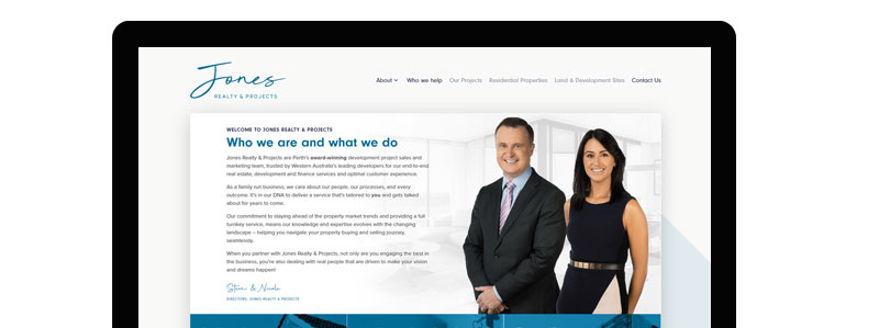
The designation of the website and its structure considered two distinct audiences: the purchasing customer first, and development clients as secondary.
The structure of the home page, including the top menu and the key categories located above-the-fold, posed questions addressing key pain points. Navigation is clear and simple.
There is a clear prioritisation of the ‘about’ and ‘information’ sections before the development listings section, laid out as a mosaic tile showcase. This was a strategic decision to introduce the new brand and company to the public. It also created a suitable landing page, laden with relevant keywords, for digital marketing campaigns targeting new and old branding, remarketing, and key search terms.
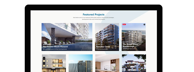
The site places a significant amount of importance on the core business offering. It features available off-the-plan apartment projects and can isolate each with dedicated landing pages. These helped to spotlight specific developments with unique enquiry channels, ensuring maximum visibility, lead capture, and sale nurturing.
New Website Design – Project Listing
The internal team needed to know how to update, remove and add new listings as they sold. We provided training sessions on how to manage this content and be less reliant on Living Online for regular updates.
Fortunately, the client had a relatively strong presence on social media and had an engaged and sizeable client email database. With these, we were able to plan pointed and timely communications informing people about the upcoming transition. The communication was open and transparent throughout.
Transition emails sent to existing clients (click to see full version)
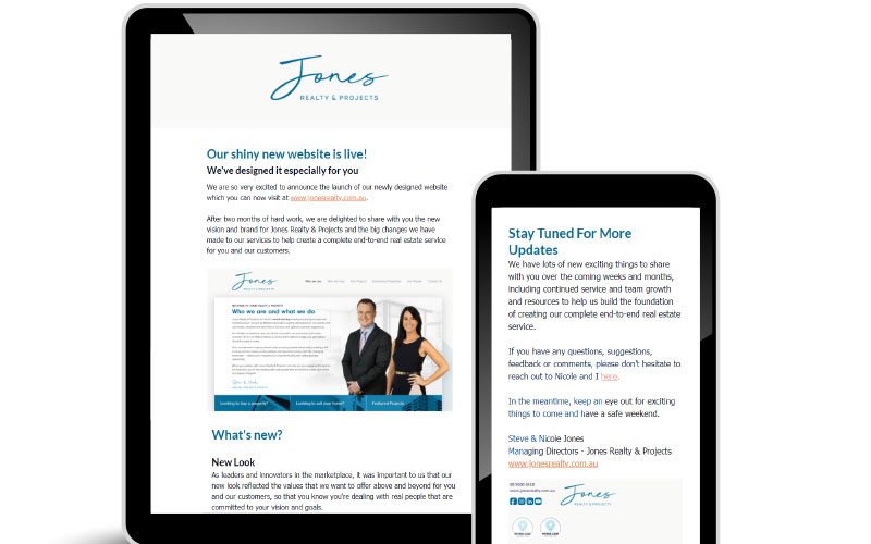
Showcasing Steve and Nicole as the faces of the new brand was key to this project. This was particularly so among the development clients. It reassured them that the same quality and efficiency they were accustomed to would continue.
We planned to ensure timely updates of the existing digital presence to reflect the new brand name and relevant links. This included everything from a redirection from the previous brand website to the new, all the way through to local community digital business directory listings.
Do you want award-winning digital marketing services?
A digital marketing agency that puts you first?
Let’s have a chat and discuss your options.
Within the time constraints, we were able to meet the client brief, develop, and deliver the new brand assets and the new website, all within the set time frame. We successfully launched the brand digitally and set up the client for future success.
The client was very happy with the outcome of the brand and website and regularly receives positive feedback from their existing client base.
Strategic Property Group

Perth Central Caravan Park

Australian Tenders